Introduction
DORA is a web-based tool for visualizing and analyzing ancient DNA (aDNA) and associated datasets. The purpose of this document is to introduce users to the features of DORA by performing certain tasks, including running analyses on preloaded data to produce the figures presented in the published manuscript.
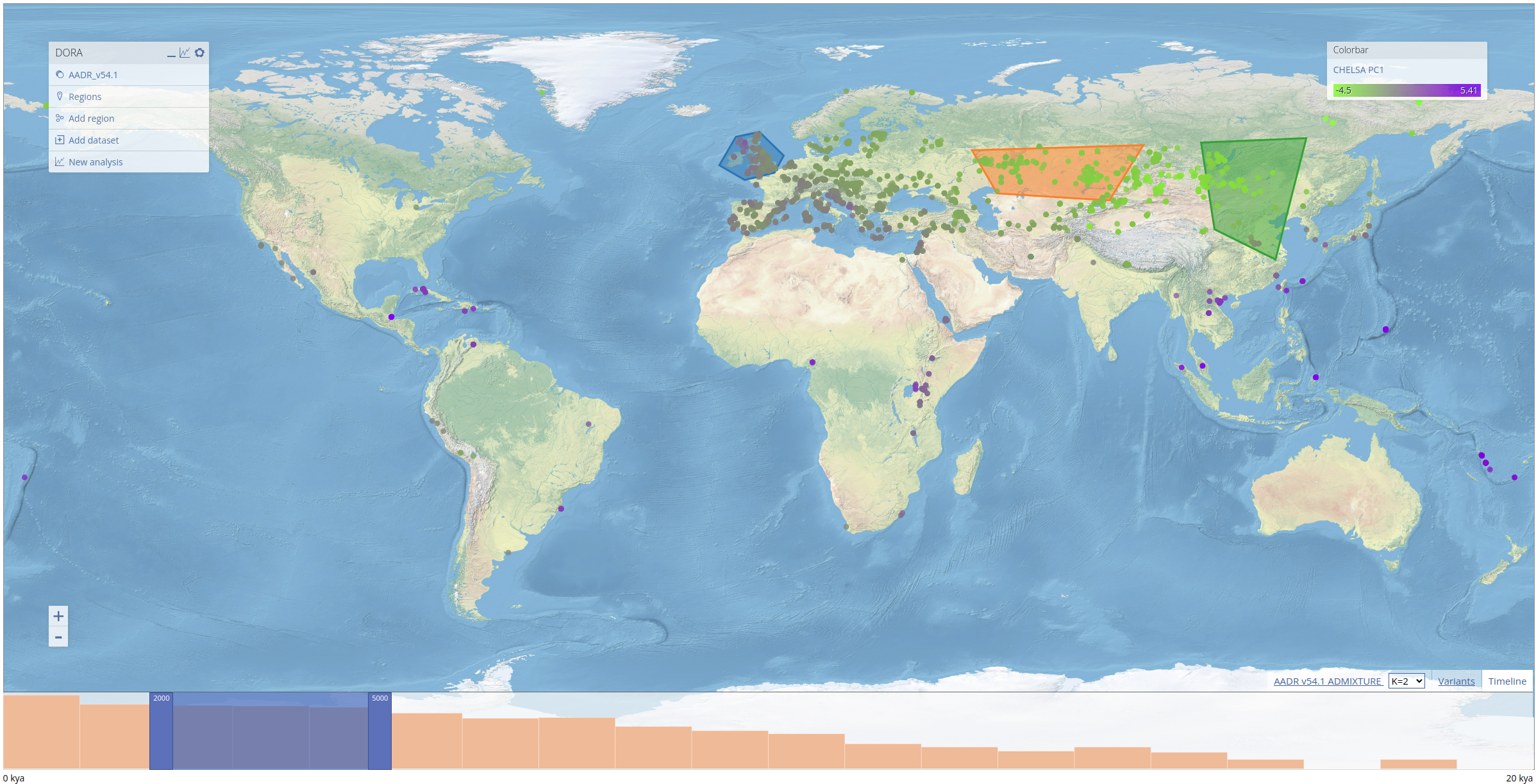
DORA can visualize aDNA individual metadata and any other data that can be associated with individuals, or has geographical and temporal coordinates. Individuals appear as colored circles on the topographical map. On the left is a menu with the currently loaded metadata layers, including preloaded layers and user-defined layers. In addition, there is a "Regions" layer that allows users to select geographical regions of interest (polygons) that will be used to define subsets of individuals. On the right is a colorbar menu that allows users to select which property of the individuals will define their color. At the bottom of the map is a timeline showing the number of individuals in user-defined bins. The timeline has a slider (a dark blue overlay) that defines the window of the currently displayed individuals. The slider can be moved by either dragging its borders (darker blue), or shifting the entire slides left or right. Metadata of individuals can be seen by clicking on the individuals on the map.
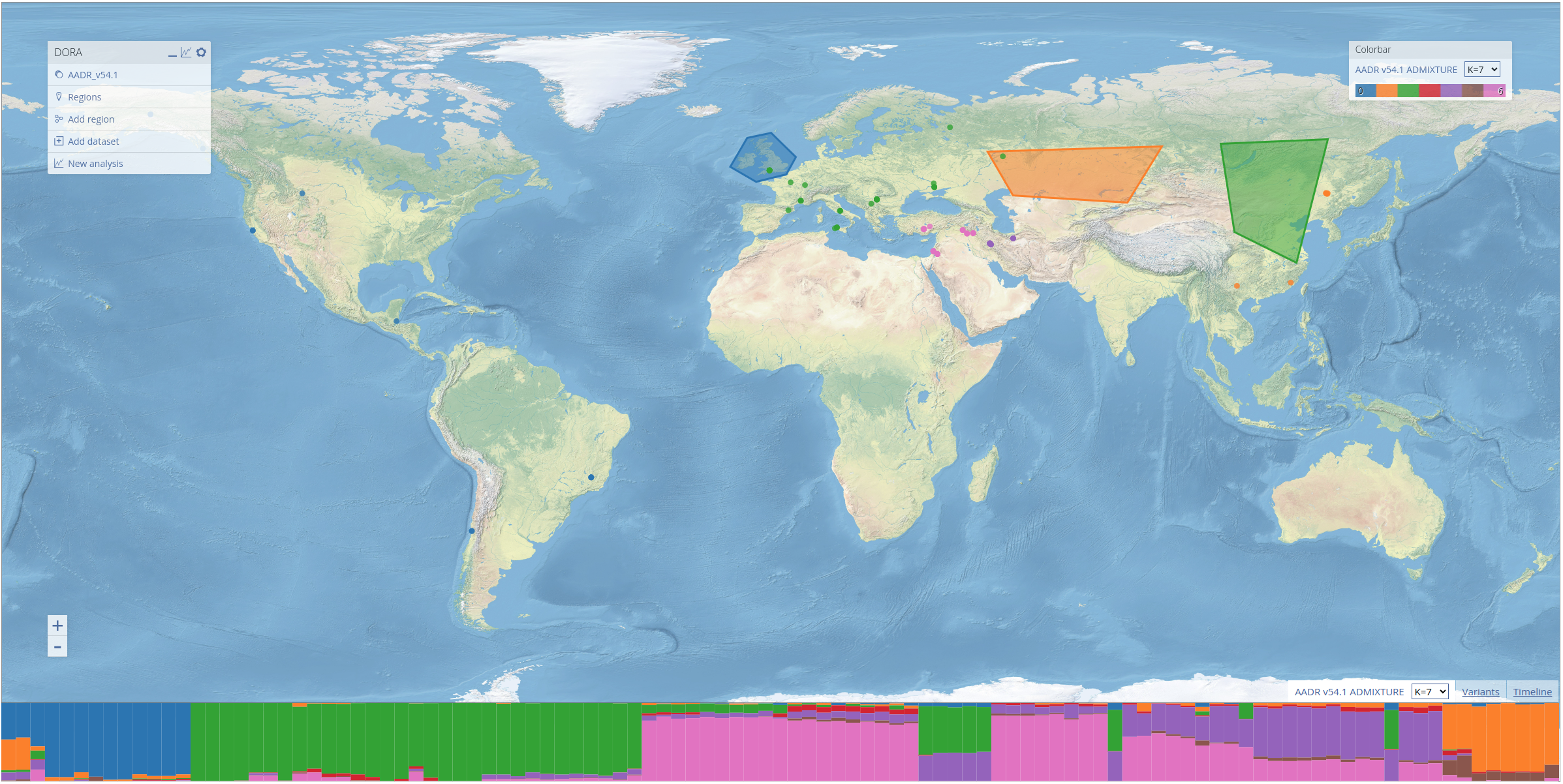
To demonstrate the features of DORA, we preloaded a number of datasets into the map. These include the Allen Ancient DNA Resource (AADR), a curated dataset containing over 10k human ancient DNA individuals and their genotypes, historical climate prediction for individuals in the AADR from CHELSA TraCE21K, and the results of ADMIXTURE analyses conducted on the AADR. These layers can be displayed by clicking on the respective entry in the "Colorbar" menu on the right. For ADMIXTURE results, clicking on the tab at the bottom of the screen (next to the "Timeline" tab) will open a STRUCTURE-style plot of the ADMIXTURE results that corresponds to the ancestry components of individuals displayed on the map, as seen below for individuals between 10-13kya).
Analyses
Geographic regions
Analyses of data loaded into DORA requires the selection of geographical regions by drawing polygons on the map. To create a new geographical region, click the "Create polygon" button in the main menu. Left-click on the map repeatedly to mark the vertices of the polygon, and, when finished, right-click on the map again, or press any other key to save the region. Geographical regions can be modified once created by clicking the polygon once (so that it is highlighted in yellow) and then dragging the vertices. Clicking on a polygon will also open a small menu to its right that allows either editing the label that the region will have in analyses, exporting individuals that are contained within the polygon in the years selected on the timeline, or removing the region. To delete regions, either press the Delete key while it is highlighted, or press "Remove polygon" in the polygon menu.
Genomic regions
DORA is optimized for running on-the-fly analyses of subsets of genotypic datasets. By default, a subset of the genome is selected for analyses. To alter the genomic regions used for analyses, open the variants table by clicking the variants icon in the main menu. The variants panel illustrates genomic regions that will be analyzed as orange boxes on a schematic view of the genome. Using this table, users can add or remove genomic regions using standard position annotation (e.g., chr4:100000-200000). Note that for "Allele frequency" analyses, the variant is specified by its rsID or genomic position in the analysis dialog box. Entries can be removed by clicking on an annotation in the variants dialog box and clicking the "Delete" button.
Some analyses, such as Fst and PCA, require loading the entire matrix of genotypic data into memory. At present, DORA has an upper limit of the number of individuals and variants that can be process for these analyses (individuals * variants < 500m). Analyses exceeding these limits are refused when the analysis is submitted, with an explanation of the current size of the analysis, rather than failing during computation.
Uploading datasets
In addition to the preloaded and Poseidon datasets, users can upload their own datasets by clicking the upload button next to "Datasets" in the main menu. Files are added by dragging them into the upload dialog box or clicking to browse. Three types of files are supported:
Individuals: a .csv or .tsv table with columns for the individual ID, latitude, longitude and date (in years before present), along with any additional metadata columns. The individuals are plotted on the map like preloaded individuals, and additional columns can be used for coloring and filtering.
Individual metadata: a .csv or .tsv table with an individual ID column and additional columns, which are attached to individuals already loaded into the map and become available in the "Colorbar" menu.
Genotypes: a PLINK dataset consisting of .bed, .bim and .fam files dragged into the dialog together, optionally together with an individuals table that places the individuals on the map. Genotypes uploaded this way can be included in cohorts and analyzed alongside the preloaded datasets.
Uploaded data never leaves your machine. Uploads are stored inside the browser, and analyses of uploaded genotypes run locally in the browser rather than on DORA's servers; only analyses of public datasets are dispatched to remote computation. Storage used by the application, downloaded datasets, uploads and analysis results can be reviewed and cleared from the "Storage" table, accessible from the "Datasets" table.
Example analyses
Here we briefly review the different analyses available by presenting the process through which the figures in the preprint were generated.
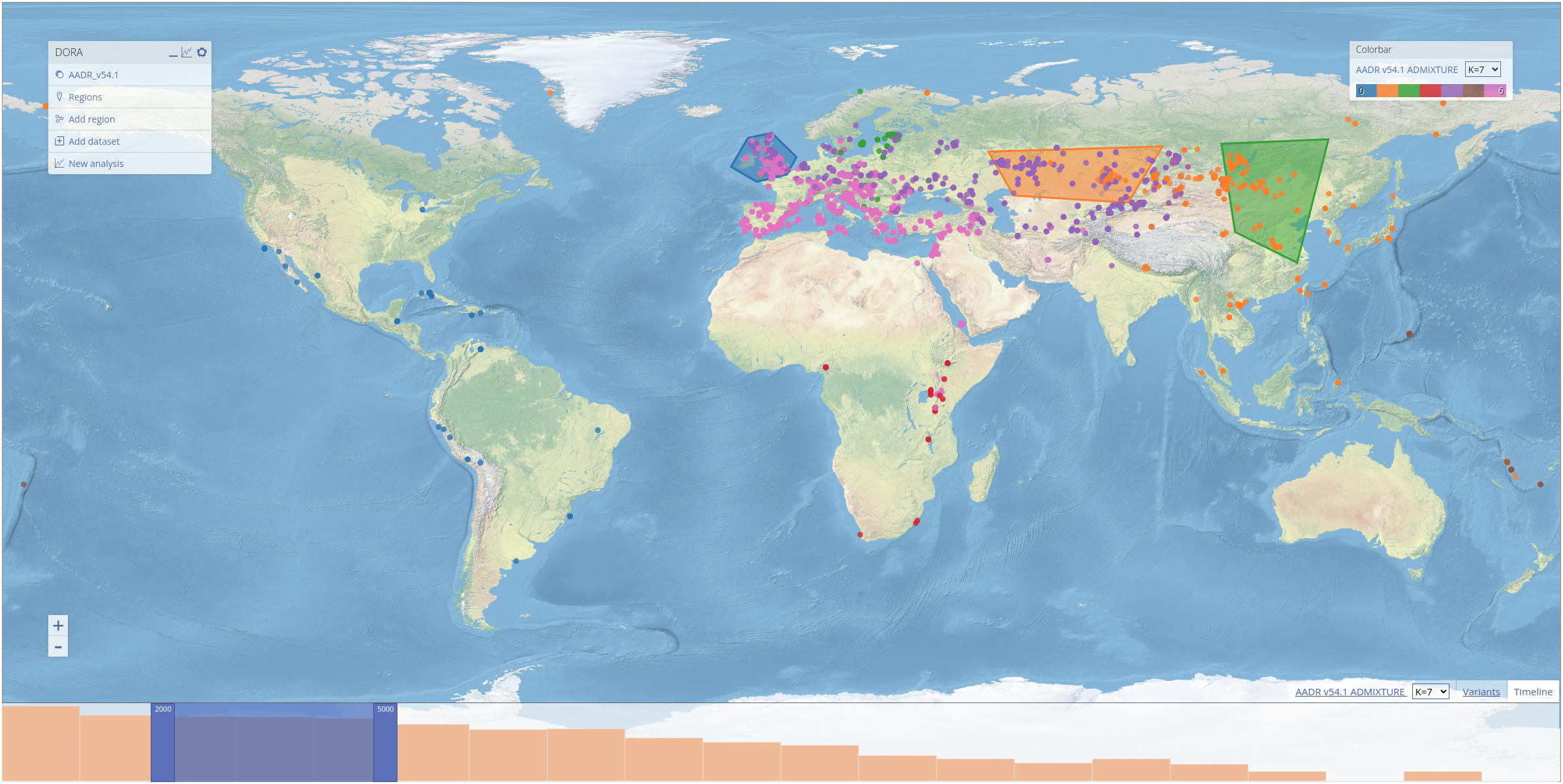
To select geographical regions, we use the ADMIXTURE results preloaded into DORA. These results were generated using all ancient individuals in the AADR (roughly 10k individuals). In the screenshot below, we selected the three regions that appear in the preprint, and labelled them "NW Europe", "Kazakh Steppe" and "East Asia", by clicking on the regions and editing their labels, as explained above.
Frequency analysis
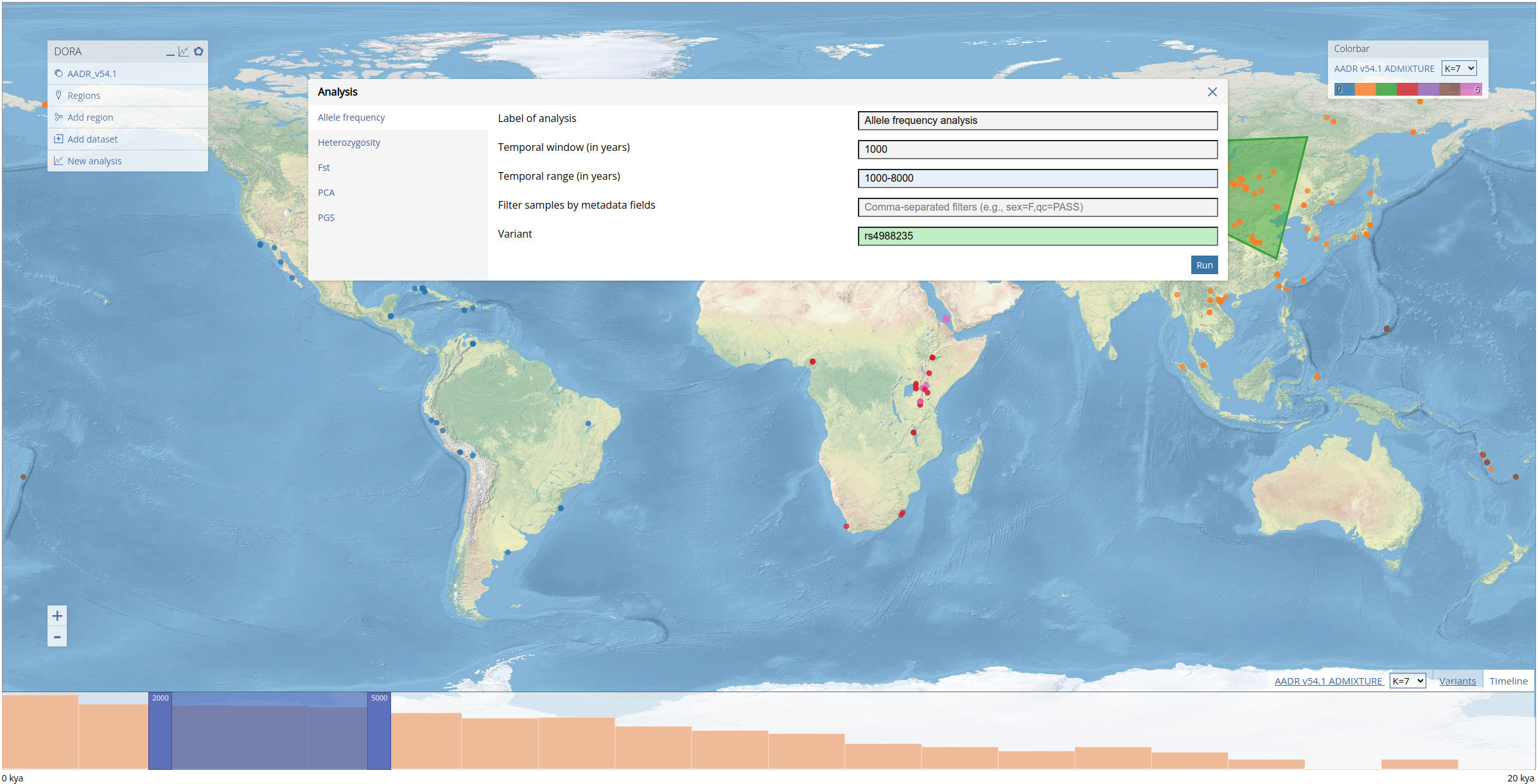
Analyses can be initiated by right-clicking the map and clicking "Analyze". This will open the "Analysis" dialog box. Each tab in the dialog box relates to a different type of analysis that can be performed. For every type of analysis, we need to define a temporal range of years for the analysis; a temporal window must be defined for all analyses that group individuals (allele frequency, heterozygosity and Fst). This field will automatically be filled with the range selected in the timeline. For the frequency analysis, we fill out the form with the same values as used in the preprint (see filled form below) for the analysis of the lactase persistence allele (variant rs4988235). Note that the "Variant" field is green because this variant ID was matched in the genotypic data loaded into DORA. If the variant is not found either by its rsID or genomic position, the field will be colored red (and the analysis cannot be run).
To run the analysis we click the "Run" button, and after the analysis has been submitted (this can take 1-5s) a dialog box will open with a link to the results. When the analysis is completed, this link will display the plotted results of the analysis. Plotting can take a few seconds to load owing to the loading time of the browser-based Python framework. It is also possible to click on this link and wait for the results to become available. Once an analysis has completed, the results will be stored in the browser cache and can be loaded either via the link provided, or through the list of analyses that can be accessed by clicking on the graph icon at the top right of the main menu.
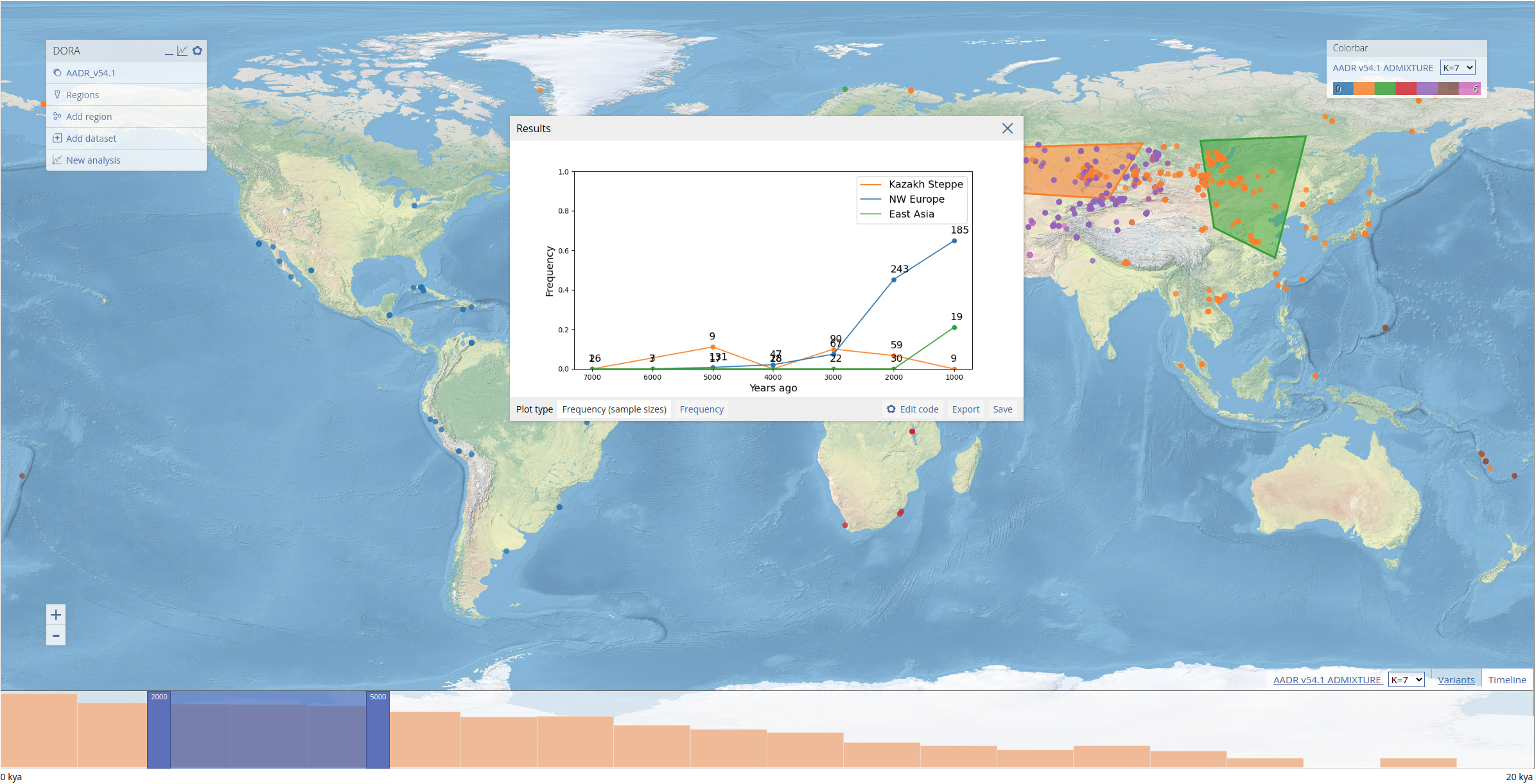
In addition to the plotted results, the "Results" dialog box contains a number of options for manipulating and exporting data in the plot. Different plot types for the data appear on the bottom left of the dialog box. In this example, we can plot the frequencies with or without the number of individuals next to each data point. The image of the plot can be saved by clicking "Save", while the source data of the plot can be downloaded in CSV format by clicking "Export".
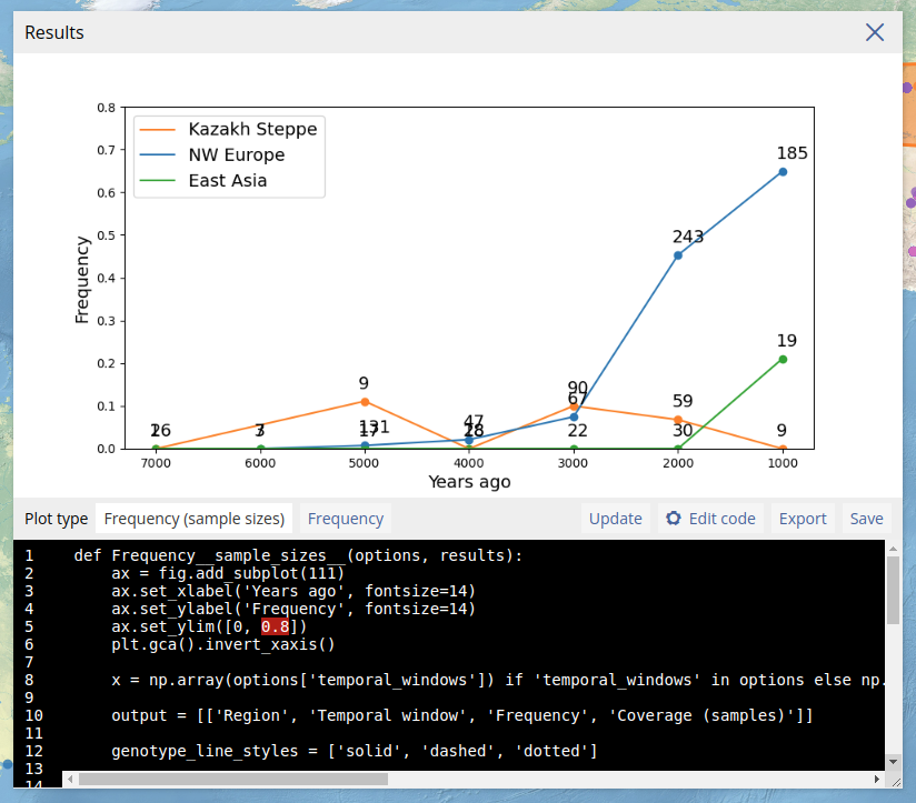
To allow customized plot, users can also edit the Python code that generates the plot. This is done by clicking "Edit code" which opens the code editor. After editing the code, the plot can be regenerated by clicking "Update". If there are errors in the code, the plot will not appear and instead a Python error will be printed. Note that custom code is not stored after the dialog box is closed. In the example below, we edited the y-axis limits and regenerated the plot.
PCA
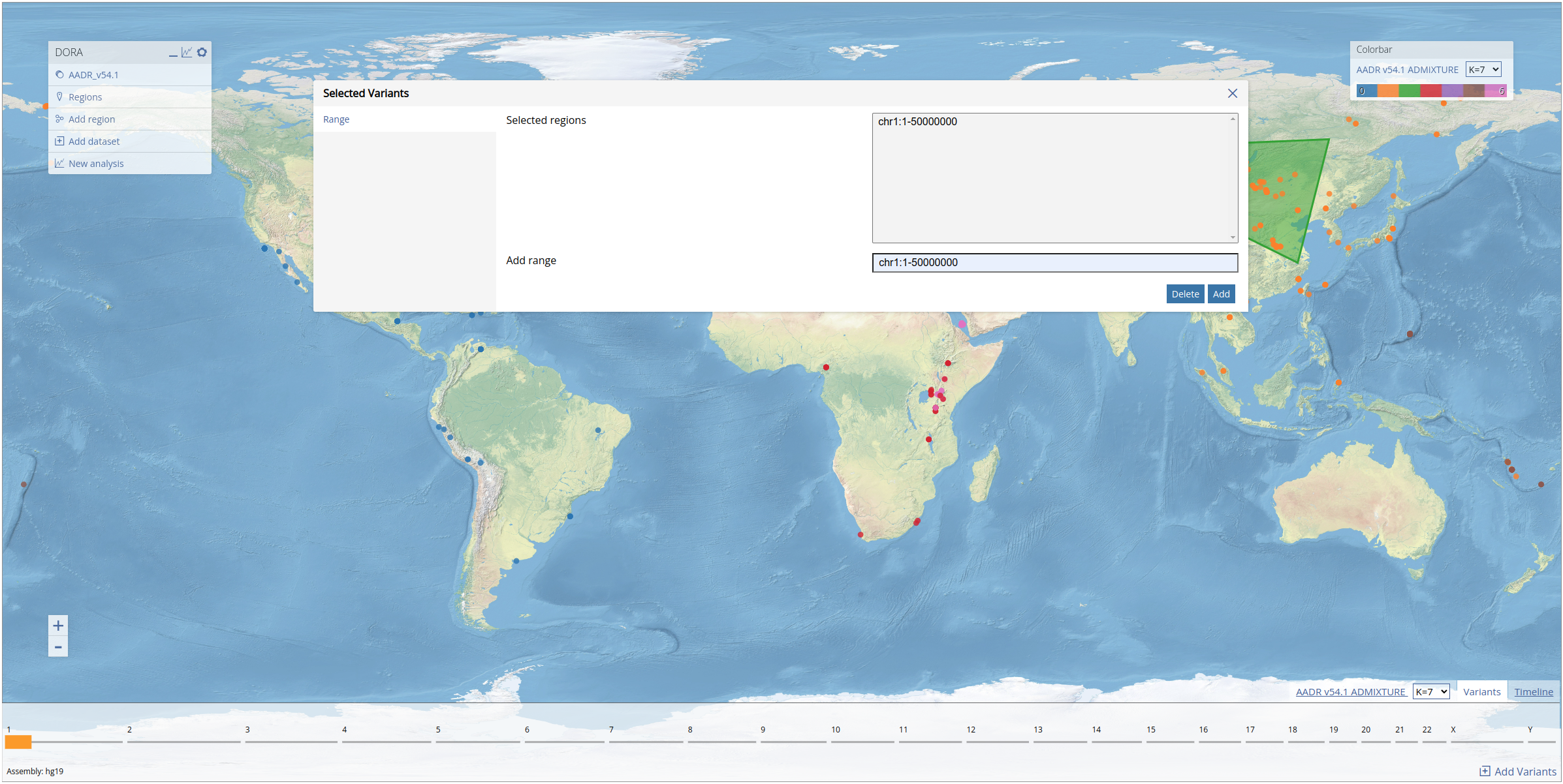
Before running a PCA, we select a subset of variants from the first 50mb of chromosome 1. As explained above, this can be achieved by opening the variants table from the main menu, filling in the range "chr1:1-50000000" in the form, and clicking "Add". The selected genomic region will appear in the variants panel at the bottom of the screen (see below).
Now that the variants have been selected, we can run the PCA on our selected geographic regions (the same regions from the previous analysis). We open the analysis dialog box and use the same temporal range that we used in the previous analysis, and filter out variants with less than 0.1 coverage (here this refers to the proportion of individuals in the subset with data for the variant) and minor allele frequency (MAF) below 0.01. In "PCA method", we use the default setting of "EMU 1.0". This uses the software EMU to compute the PCA, which is suited to matrices with high levels of missing data. This analysis is computed on a large number of individuals and variants and so the running time is much longer (this specific analysis ran for approximately 3 minutes). Additionally, we can run the analysis only on individuals that match a certain condition relating to the individual metadata ("Filter individuals by metadata fields"). We leave this field empty to include all individuals.
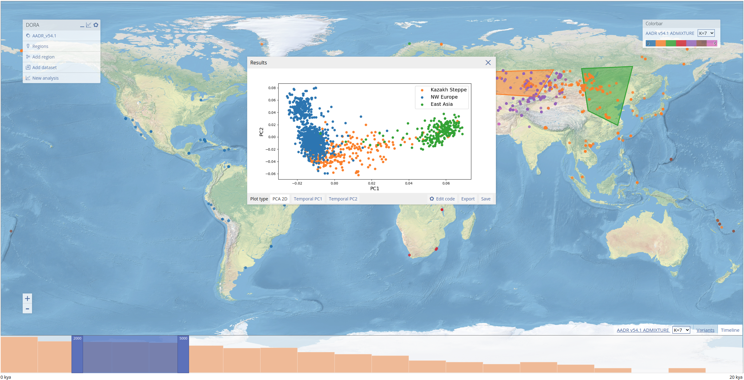
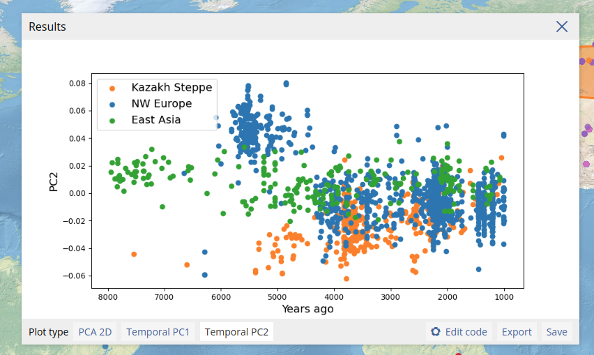
We can also plot the results of the PCA along the temporal axis of the data (below the esimated date of individuals is plotted on the x-axis, with PC2 plotted on the y-axis).
Pairwise Fst
Similarly to PCA, for Fst analyses we also define genomic regions (in this example we will use the same genomic region as above). We open the analysis dialog box and fill out the same temporal range as the previous analyses (1000-8000 years ago). As we will group individuals for the pairwise analysis, we also need to define temporal windows in years in the form. We can optionally filter out variants and individuals that fall below a certain threshold; as in the PCA above, here we filter out variants with less than 0.1 coverage (as with the PCA, this refers to the proportion of individuals in the subset with data for the variant). As above we leave the metadata filter field empty.
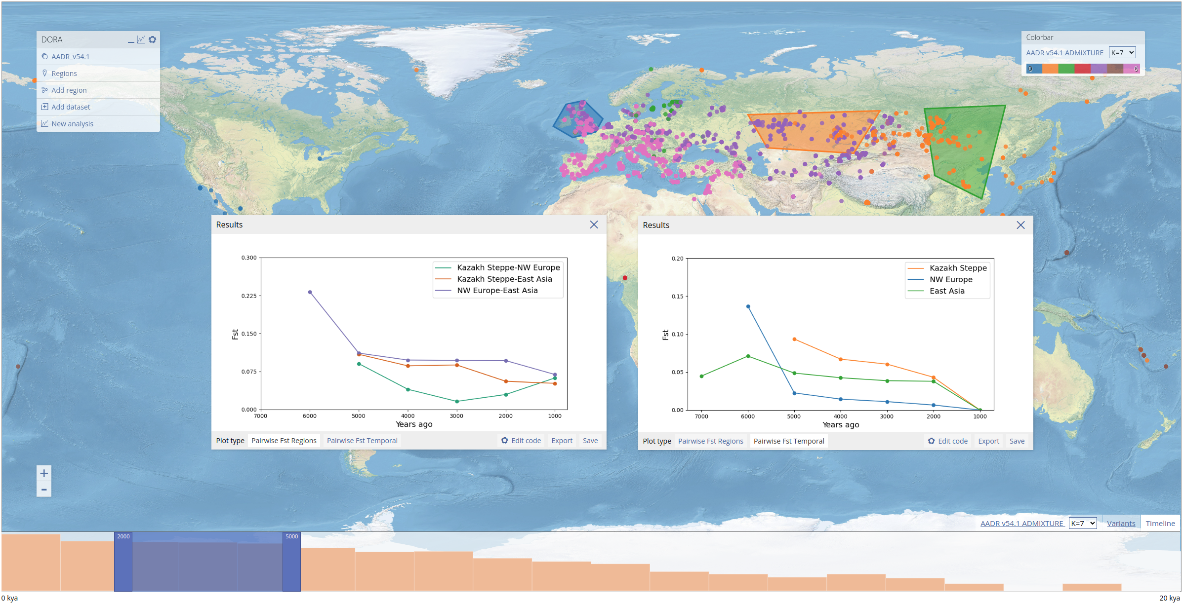
The Fst analysis takes all subsets of individuals (regions * temporal windows) and computes the full pairwise Fst matrix. Above we show two displays of these results: on the left, the pairwise Fst values between regions within each temporal window; on the right, the pairwise Fst values between the most recent temporal window and each preceding window for each region (for the most recent temporal window this value is not computed but set to 0).
PGS
To conduct PGS analyses we first select a PGS from PGSCatalog. When creating a PGS analysis, the analysis form opens the PGSCatalog table, which can be searched by trait. In this example we selected a height PGS (PGS000297) by searching for "body height". In the table, we see the number of variants in the PGS, and the number of individuals (and assigned ancestries) included in the GWAS. Note that the number of variants that will ultimately be used in the analysis will depend on the overlap of the PGS variants with the variants of each of the genotypic datasets loaded. DORA will attempt to overlap the variants using rsIDs and effect allele (note that the effect allele should be the second allele in the BIM file). If no rsID column is present in the PGS file from PGSCatalog, it will try to overlap the variants by position. This will fail if the assembly is different between the genotypic dataset and the PGS.
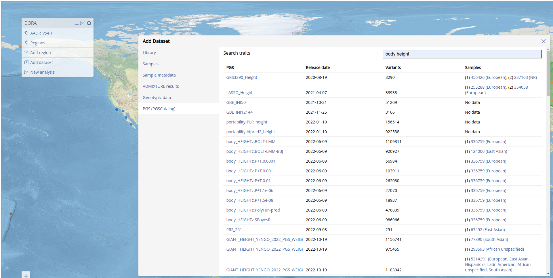
Adding the PGS may take time depending on the number of variants it includes. When the PGS has been added, DORA will reload the page.
We can now run the PGS analysis by again opening the analysis dialog box, and selecting the "PGS" tab. We now need to locate the PGS we just added. We can do this by typing in the "PGS" field, which will search in the list of added PGS. Typing "height" should now return the result "GRS3290_Height (body height)". Clicking on this result add this PGS to the analysis. We set "PGS score calculation" to "mean" to correct for the effect of coverage on individual PGS values. We leave the variant and individuals coverage filters at 0, and use the same temporal range as for the previous analyses.
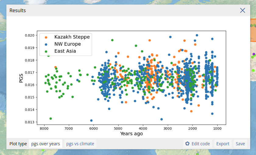
We can plot the PGS of individuals together with any other metadata attribute available for the individuals. In the example above, we plot the date estimate of the individuals on the x-axis, and the predicted height on the y-axis. We include also an option to plot the PGS values along with the individual climate data.